in drawing

I finished a second sketchbook this year! It took me ~8 months to fill up this tiny Stillman & Birn Alpha, making this one of my fastest sketchbook completions.
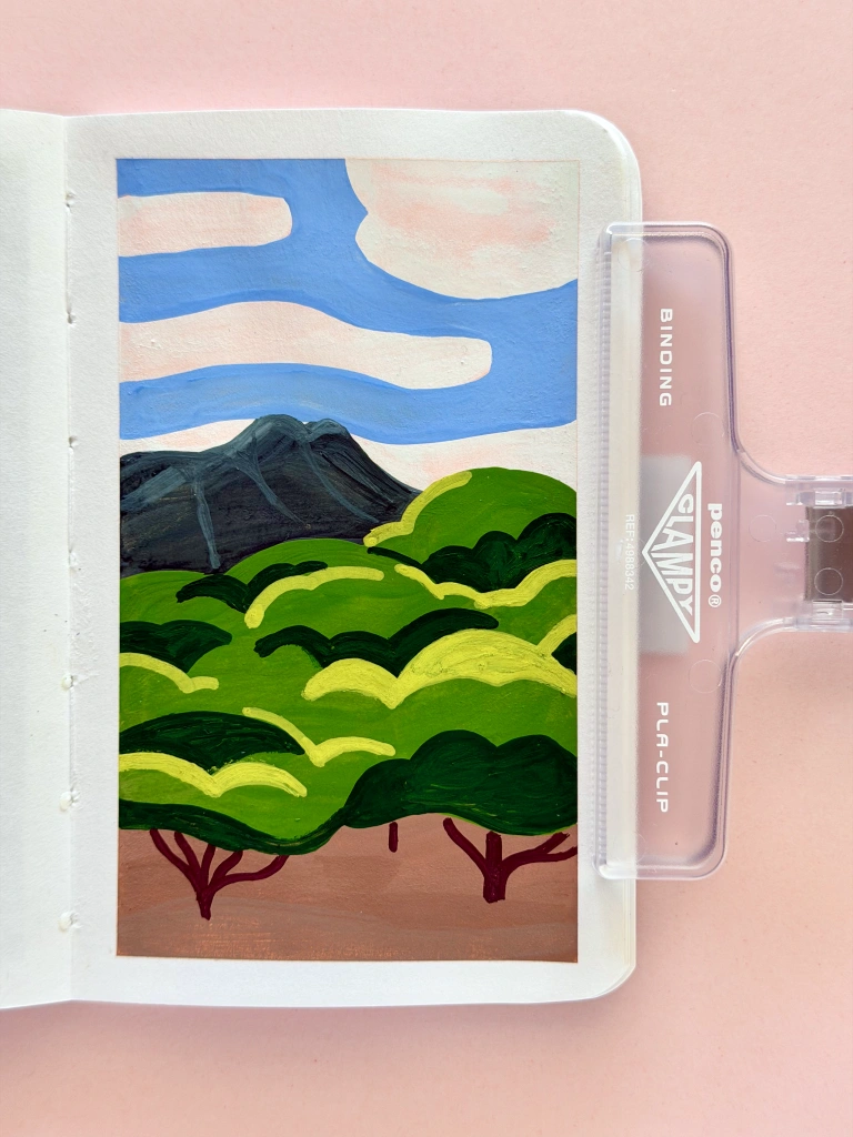
A small, rectangular sketchbook with a gouache painting of a mountain. A large cluster of trees stands in the foreground, and clouds drift by overhead. The forms of the paint are kind of squishy and rounded, and a pink under-layer peeks through the paint.

Re-drew a scene from Oahu, Hawaii to test acrylic marker as a base layer for a gouache painting. I like the look!

I really enjoy working in this size (3½ x 5½", softcover). It’s both portable and lower-pressure, since it’s so easy to fill a spread. Working in a small format has been quite useful for me this year, as I’ve drawn orders of magnitude more frequently than in recent years.
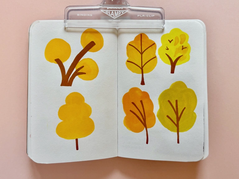
Trees with fall foliage, rendered in a graphic style. There are circular blobs of gouache for the leaves, and bendy, graphic lines in acrylic marker for the trunks and branches.

Trees in the style of one of Sophie McPike’s Scribble Brigades. This way of stylizing trees feels natural to my hand.

This sketchbook includes plenty of play around palettes, shape language, and which medium I prefer for a given subject.
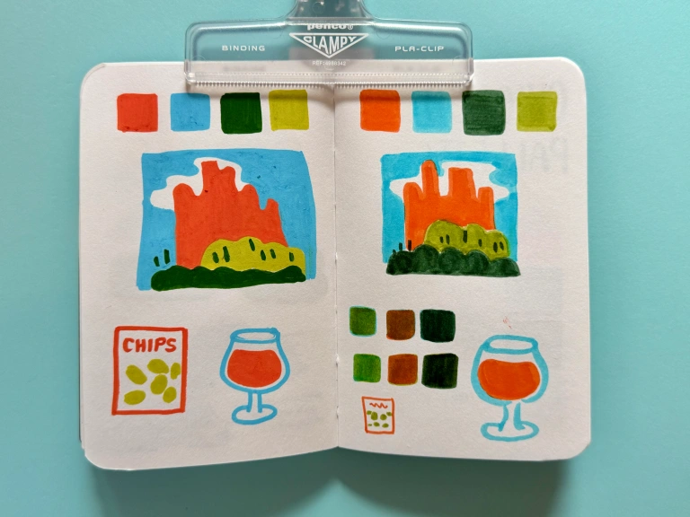
Two pages sampling palettes of orange, light blue, dark green, and olive green. The left has graphic acrylic marker, and the right has Tombow markers and shows some layering. To test the palette I drew in each medium a scene from Garden of the Gods, a glass of beer, and a bag of chips.

Working out a palette for a Colorado trip. Tombows (right) are more convenient for travel, but dang if I don’t prefer the boldness of my Poscas.
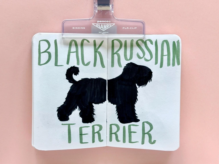
A very black, very fluffy dog stretches across a sketchbook spread. In green Tombow marker, 'Black Russian Terrier' surrounds the dog in big block letters

My favorite drawing from Doggust. I chose to do a weekly instead of daily dog.
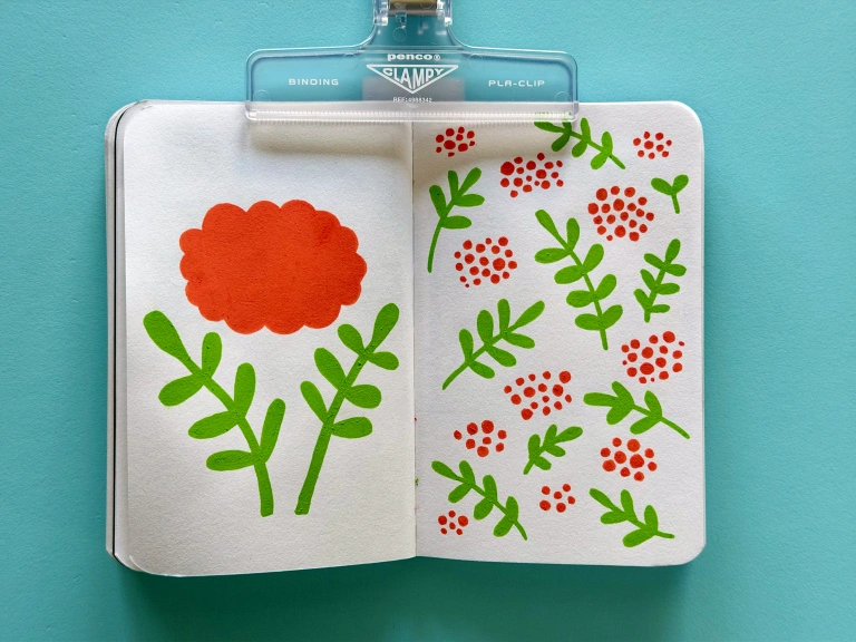
Graphic drawings of the parts of a mountain ash tree, done in Posca markers. The left-hand page has a single large cluster of orange berries and two large branches of leaves. The right has a scatter pattern of these forms.

Mountain ash trees are so beautiful to me

Playing with Troublemaker Petrichor ink

In these pages I was playing with Troublemaker’s Petrichor fountain pen ink as an art medium. I love the chromashading you get when adding just a little bit of water.
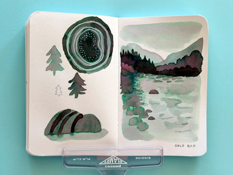
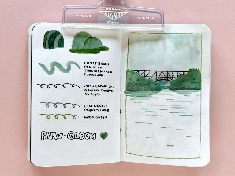
A spread with drawings done with paintbrush, dip pen, and ink. The ink is chroma-shading, so the doodles are various tones of grey that lean light teal or a bit purply. On the left are doodles on conifer, a geode, and rocks. On the right is a river scene with mountains, trees, and a dusky sky in the background.
On the left, a palette I called PNW Gloom, which includes Petrichor, two green Luminance pencils, and black fountain pen ink. On the right, I combined these materials into a hazy drawing of the bridge at Deception Pass, WA.
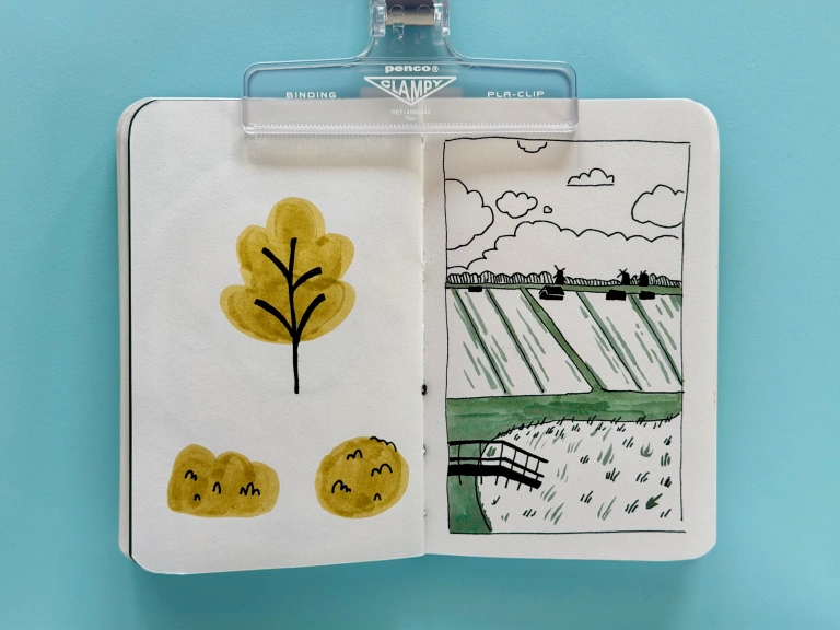
More graphic trees in marker on the left, and a view of Zaanse Shaans on the right. It's a black and white line drawing of windmills and canals, and the canals are filled in with a flatter layer of the Troublemaker ink.

Boston sketches

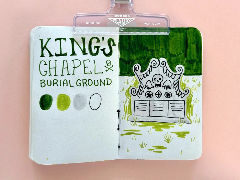
The left says King's Chapel Burial Ground, and has a Tombow marker palette of two greens, a light grey, and the white of the paper. On the right is a drawing in these colors, with a gravestone as the focal point. The headstone has a skull and angel wings, and is bordered by some swirlies and feathered-wing shapes.

Gravitated towards the stylization on these gravestones
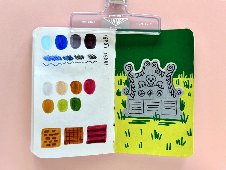
On the left, noodling about a palette in blues, and a more traditional urban sketching palette with neutrals. On the right, a repeat of the headstone but done in opaque acrylic marker.

Drew this again in Posca markers. Which do you prefer?
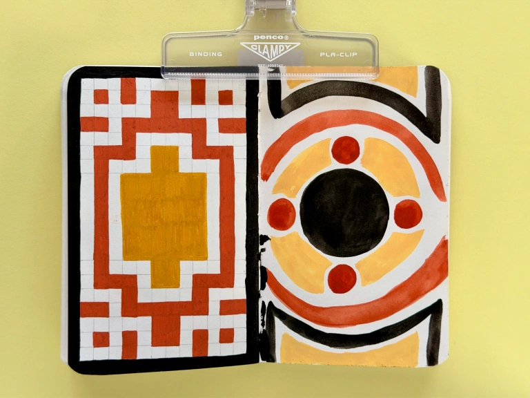
A spread of abstract geometric compositions done in black, brick red, and ochre. The left is very geometric and gridded, and the right is painted and therefore more gestural. The right has a circle in the center with smaller circles surrounding it. In the fold there's a big logn splotch of black paint.

Ahhhh splodge of death! These are two renditions of marble floors in the Massachusetts Statehouse: one in acrylic marker and the more gestural page in gouache.

Chicago sketches

I ended up not using the Chicago-bulls-inspired palette I came up with, but I did draw a sculpture from the Art Institute of Chicago, twice.
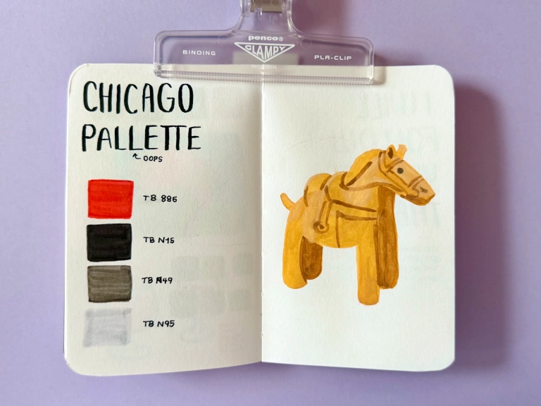
On the left, 'Chicago Palette', miss-spelled with 2 Ls. There's a Tombow marker palette of red, black, and two shades of grey. On the right is a gouache painting of a cute little ochre horse with a saddle, shown in 3/4 profile.

With my first attempt at this horsey fren, I was frustrated by my mark-making as I didn’t give the base layer of gouache enough time to dry. In hindsight, there’s something charming about it, and the proportions are cuter and more interesting.
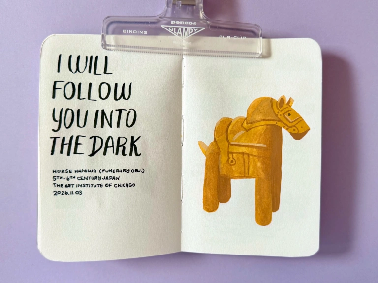
On the left, I wrote I WILL FOLLOW YOU INTO THE DARK. HORSE HANIWA (FUNERARY OBJ.). 5TH - 6TH CENTURY JAPAN. THE ART INSTITUTE OF CHICAGO. 2026.11.03. On the right is the same horse from the last spread, but it's taller and more skillfully painted. Linework is more precise and the shadows are a richer brown.

For the second attempt, I added some Death Cab lyrics alongside the haniwa. This horse is a funerary object that accompanies the deceased in the afterlife.

Thoughts on the Stillman & Birn Alpha

Pros

  • Bright white paper (my preference)
  • Handles mixed media very well
  • Paper is sturdy enough without being too thick for my taste
  • Lays flat, though I always start by breaking in the spine a bit

Cons

  • More expensive than some of the other sketchbooks I use
  • No fun cover colors (personalization can solve this problem)
  • Would probably go with smoother paper for Posca markers. The S&B Epsilon worked well in the past, so maybe I’ll get one again and see how it handles wetter media, such as gouache.

No comments yet on this post.